How Not to Brief a Designer (But Somehow Get It Right Anyway)
Remember that Cân Bardd review I did a while back? The one with full-body, moss-in-the-lungs, chest-clenched kind of immersion?
Yeah. Well. That turned out to be the start of a completely different side quest.
Because somewhere in the middle of my research rabbit hole, I came across the name of their logo designer—and for reasons known only to my deeply unwell brain, I decided that was a thread worth pulling.
Now, my own logo has been a thorn in my side for a while. I had it made when I started the blog—something along the lines of “just make it look black metal, you know? Whatever.”
And it did the job. A safe, serviceable stamp. But lately, it’s felt about as personal as a stock photo of a raven.
The blog has changed. I’ve changed. The logo hadn’t.
So, naturally, I stalked the designer. And proceeded to send him one of the most unreasonable design briefs ever committed to the internet:
| I want something that screams and whispers. That aches a little. That holds all the feral softness, the grief, the noise, the tenderness. A logo that feels like home – even if home is a collapsing forest full of reverb and teeth.
Honestly, that should’ve ended the conversation.
But it didn’t. Because the legendary man that opened that message was actually game.
Scribbles, Screaming, and Less Symmetry
I didn’t want a logo. I wanted a sigil. A visual howl. A haunted whisper scribbled in root and rot.
He asked for more detail on what I wanted. What he got was a far-too-long email about everything I didn’t like about my current logo. Wildly helpful.
But he accepted it. Patiently. Like a man who had already resigned himself to a moss-themed spiritual detour.
And then he got to work. Sent me four rough sketches. I honed in on one immediately.
We started sharpening. Loosely. Emotionally. Illogically.
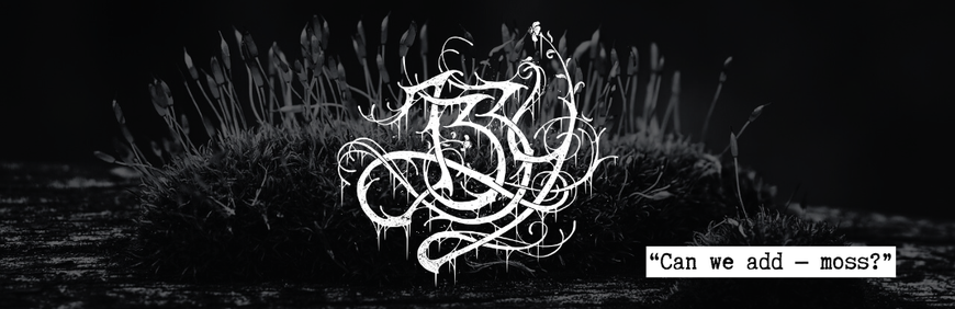
I said the letters were too tribal, the Zs were falling apart, and maybe he could sprinkle in a bit of that “smoky energy” from sketch three. Oh—and the flower in the corner? Loved it. Possibly illegal levels of enthusiasm over one haunted petal. Asked how he felt about sneaking in more flora. Like that was a real instruction.
Words like spores, particles and feelers were used.
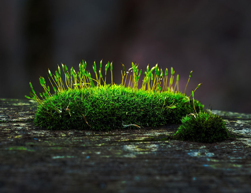
And bless him—he actually went and looked up MOSS MACRO PHOTOS.
He literally sent me a new draft with a fucking link to a a moss stock picture and said: "weniger Borsten – und die, die blieben sind etwas von diesen Fühler-artigen Auswüchsen von Moos inspiriert"
And honestly, at that point? I was already stupidly happy.
Because it was working. He was listening. And somehow—he was turning my strange, poetic nonsense into lines and curves and blooming static.
And when he dropped that moss macro link? I went full gremlin. Just the mental image of him sitting at his laptop, solemnly googling "moss close-up" because I’d said something like "more moss, maybe"—it nearly ended me.
The Final Form (and the Feral Joy That Followed)
He sent the final version.
I opened the file. Looked at it. And went—
Yep. That’ll do. That’s me.
He had taken my emotional soup and forged it into an actual sigil. A thing with lines. And spores. And those weird feeler bits from moss.
And seriously? I love it.
It roars. It whispers. It blooms and unravels.
It is messy and mossy and mildly possessed.
Still screaming.
Now also whispering.
Proudly decomposing in the most beautiful way.
So here’s to rebrands.
To grief-fuelled reinventions.
To logos that are 87% emotional damage and 13% haunted foliage.
And to Domme—who read “reverb and teeth” and said, “Yeah, I can work with that.”
You didn’t just make a logo.
You summoned whatever this is.
And I could not be more unreasonably delighted.